
A website created for the multi-disciplinary non-profit behind one of the largest yearly music festivals in Southern Uganda.
Services
Built in collaboration with the Denver-based non-profit, Global Livingston Institute.
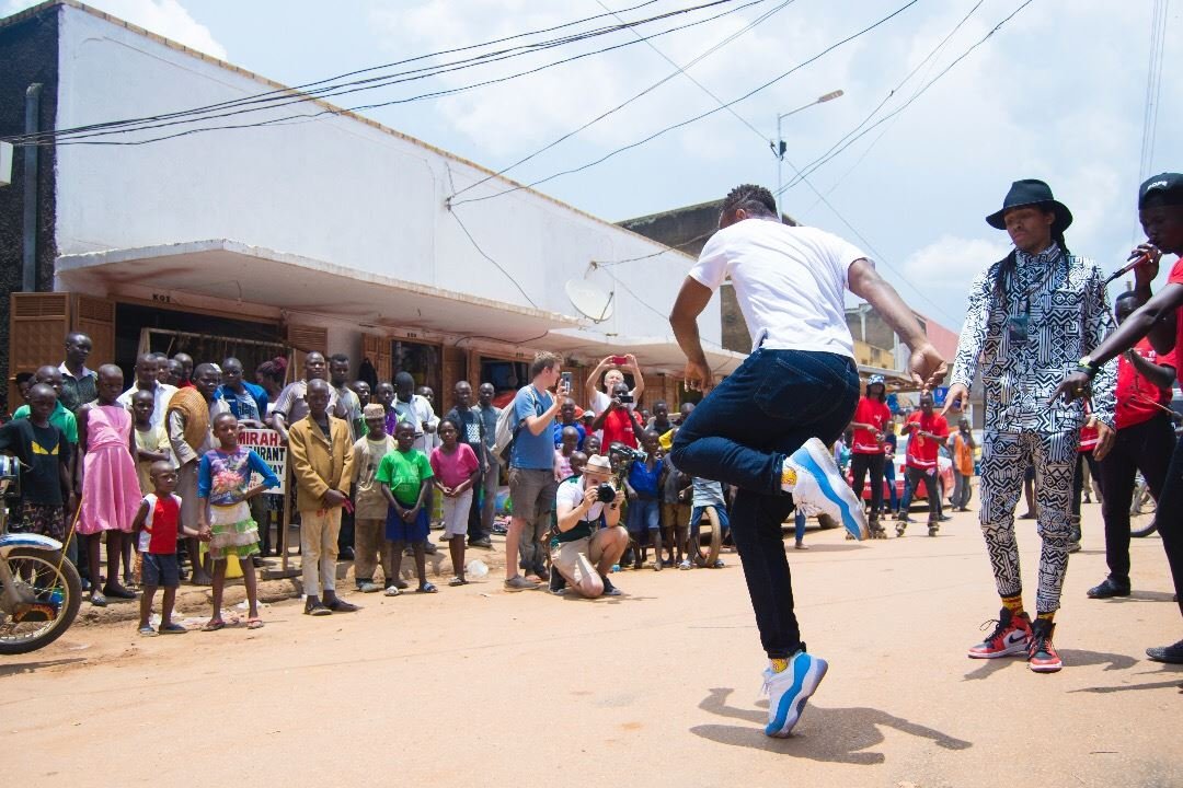
Founded in 2009, GLI educates both students and community leaders on innovative-approaches to international development. Empowering awareness, collaboration, and personal growth. What began as a modest non-profit has grown over the years into a unique resource for job creation, vocational programs, social and community development, as well as hosting the largest free music festival in East Africa.
In our initial redesign, we faced two main challenges, both of which boiled down to organization. There was a tremendous amount of information around their various projects, divisions, initiatives, and campaigns, all of which needed to be restructured within a more modern, flexible design. Related to that info, the team behind GLI had amassed thousands visual assets, much of which had not been seen outside of a small circle.
Connecting the dots
Before starting the redesign process, we first needed to familiarize ourselves with the past, present, and upcoming projects that users might be looking for when visiting GLI. Often, this step simply requires that we dig deep into the archives of a website — however, some of the more recent projects existed only as internal PDFs that the team had been sharing with various partners and supporting institutions.
It was time to breakout the whiteboard and get color-coordinated.

Programs and Projects were sorted under a streamlined directory. Initiatives, such as immersion trips, leadership retreats, and internships, were organized under involvement. Ongoing endeavors, such as Entusi, Bulamu, Staffable, and their yearly iKnow music festival — which has helped provide over 25,000 free HIV test — were each built respective pages, consolidating information that had previous been somewhat segmented.
Flat vs hierarchical
There are two ways of organizing pages within a website: “flat” vs “hierarchical”. To be as brief as possible — since this isn’t the most exciting of topics — “flat” simply means every single page is just one level under the domain name, let’s use a few of the old GLI pages as an example:
globallivingston.org/contact
globallivingston.org/contact-thanks
globallivingston.org/model-farm
globallivingston.org/entusi
globallivingston.org/team-entusi
The issue with the above structure is that a search engine has no idea that /model-farm and /team-entusi are related projects, or that /contact-thanks is related to /contact. Each page only has a single path, represented by the “/”.
A far better way of organizing related pages within a website is the following:
globallivingston.org/contact
globallivingston.org/contact/thanks

globallivingston.org/pro/farm

globallivingston.org/entusi
globallivingston.org/entusi/team
Now, when search engines are indexing the website, a structure becomes clear. /thanks is connected to /contact, /farm belongs alongside other projects, and /team is related to /entusi. In other words —
Instead of your pages looking like a lawn, they resemble a tree with a trunk, branches, and twigs.
When restructuring an existing site there’s one last (very, very important) step to take: leaving behind a map for search engines to follow as they look for (old) pages they have on record.
/contact-thanks -> /contact/thanks 302
/model-farm -> /pro/farm 302
/team-entusi -> /entusi/team 302
Without this map your site’s ranking in search results will drop significantly since search engines will mistakenly believe many previously-known pages have suddenly gone missing, and since people don’t go searching for missing pages those URLs are no longer important and your site becomes that much harder to find.
Simply put, the map tell the search engine where the old URL was and where the new URL can be found. That’s it. Most sites will have a handful of redirect URLs that need to be mapped, for GLI we remapped several dozen URLs.
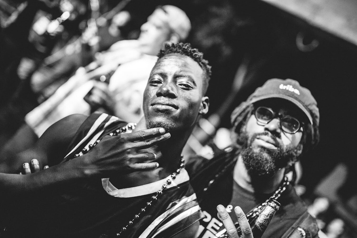
Every picture tells a story
It’s not uncommon for clients to have a limited-number of visual assets when first setting out to build a website. After all, creating photos (and video) that best represent your business/voice is an entire process. However, in the case of GLI, we were excited to find an vast library of media that, to a large extent, hadn’t been seen by many people outside of the non-profit. Best of all, many of the images were beautiful and full of energy.


Not only did we work with the team to help sort selected images by programs, projects, retreats, so on — putting a face to the name, so to speak, to each of the initiatives that GLI was involved with — we also edited video highlights for specific pages as part of the redesign process.
Our goal was simple, to help create a story that could be understood within moments of landing on a particular page. We did this by ensuring selected footage was 1) high-quality, 2) maintained an equal pacing, 3) felt balanced in terms of faces vs environment.
Out of the half-a-dozen video edits we created, one of our favorites is from the Tour du Rwanda section of the yearly music festival page. This section highlighted GLI’s 2017 partnership with the Rwandan Cycling Federation, the Rwandan Ministry of Health, the U.S. Embassy in Kigali, and the Colorado Classic, organizing a free music event in which 8,000 people attended. The music festival helped provide 500 free HIV tests, and nearly 600 free comprehensive health screenings, among other services.
Speed doesn’t just win a race
One risk of including a video loop within a page is load-time, and considering some of the GLI pages were designed to feature multiple video loops, we needed to find a way to ease the stress a browser would feel when attempting to autoplay 2-3 video loops all at once. In comes JavaScript —
window.video_backs_settings = {
            buildCustomVideos: false, // build simple video iframes
            useProviderThumb: true, // mobile fallback image
            scrollDebounce: 50, // time in ms for scroll debounce
            offsetCheck: '5%', // define as 200 or '20%'.
            pauseOnHidden: true, // if user goes to another tab
            pauseOnBlur: false // if window lost focus
        }
Simply put, this little bit of code helps do two things, first it detects what area of the page is currently visible/active by a user, and then makes sure to pause or autoplay the video only when it can be seen. This helps keep load times snappy while ensuring the user always sees a beautiful video as they scroll about the page.